Case study: Designing for languages

Posted Tuesday, 18 November 2014 by Amy
Over many years, Wingfinger has forged a close and effective working relationship with leading development and relief charity Tearfund. We design international resources including a 16-page magazine, an ongoing series of resource books, and a large number of other documents and policy reports on topics including HIV/AIDS, water and sanitation, climate change and disaster relief. These are often written as part of Tearfund’s input to international conferences on development issues.
Portuguese, Russian and English versions of the same document
A substantial part of this work is published in four language editions – English, French, Spanish and Portuguese – and we’ve also produced publications in Russian, Zande and Lusoga, Hebrew and others.
Room to manoeuvre

Right from the start of an initial design in English, we keep in mind design features that take account of eventual translations. We try to build in extra space and flexible elements that can adapt to the different language flows. If the English text styles are applied to most of the languages we’re working with, documents could end up longer by as much as a quarter. So we have to create different styles that enable a translation to fit without losing legibility or appearing too cramped. Other text, such as headings and captions, needs to be reduced in proportion to keep a balanced look.
There are also grammar and punctuation idiosyncrasies. The French have a space between text and guillemets, colons and brackets; a capital letter for only the first word of a person’s title is used in Spanish; in Portuguese, accents are retained on capitals and double quotes are used… to mention just a few!
Easy access
There are other challenges, too. Materials can end up in widely differing contexts, cultures and language groups, and where readers may have weaker literacy skills. Because of this, we try to put ourselves in the end-user’s shoes, working hard to ensure that the structure of each document is as clear as possible. We’ll use navigation aids if necessary to help readers find their way around, and keep the flow of text and image content clear and easy to follow through.
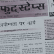
A requirement of most of the international resources is that the documents and files we produce should be accessible by Tearfund’s partner organisations around the world, enabling them to produce localised versions. Some of those have been in Hindi, Cantonese and various African languages. Although we had nothing to do with these subsequent translations or their production, it’s reassuring to know that the designs are usable even where rich-world technology doesn’t exist.
The complete package
Our work in international publications often requires additional resource material or multi-language packages. Wingfinger have designed books, magazines, leaflets, posters, interactive CDs, mail shots and banners in conjunction with language jobs, all of which benefit from our long experience in this complex design area.
Have a look through the gallery to see a full range of work we have done for charities, non-profit organisations and environment campaign groups.
More information…
Many of the international resource documents we’ve produced for Tearfund are freely available to download and can be found on their TILZ website. More information about this development charity, their aims, project work and campaigns can be found on the main Tearfund site.
As well as the languages used in graphic design above, Wingfinger has produced multi-language work in German, Welsh and Hebrew for other clients.